Early Logo Sketches
In the beginning the name of the exhibit was not decided yet. As a group we were coming up with names and I started on some rough sketches for what the logomark and logotext could look like for a variety of names. It was already decided that the exhibit would be educational, fun, and interactive so I kept this in mind all throughout the design process. By this point there was no exact color scheme or anything else to go off of aside from the concept, tone and purpose of the exhibit. Still, I sketched most of the ideas that popped into my head on a sketchpad with pencil as seen below.
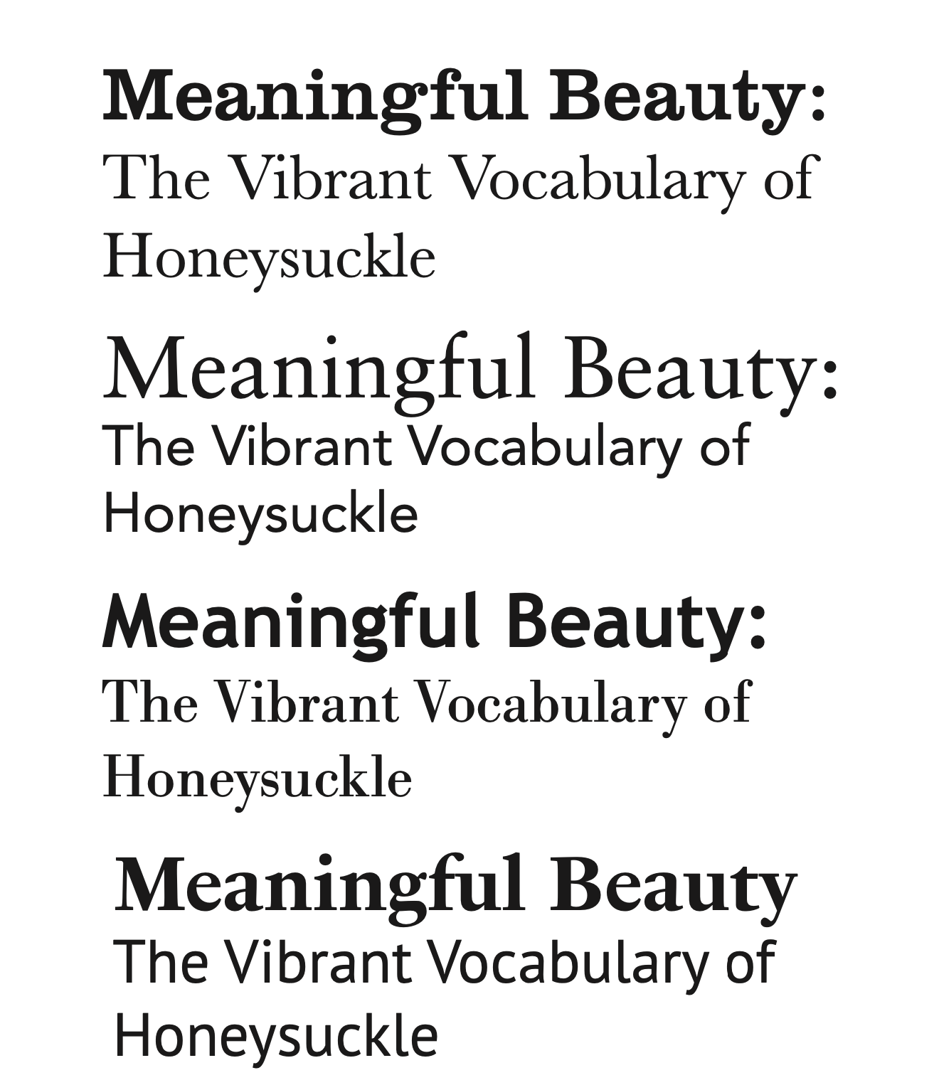
After this point the exhibit finally had an established name: "Meaningful Beauty: The Vibrant Vocabulary Of Honeysuckles". With the name established my sketches from here on out focused more on the logomark. I did sketches of many different honeysuckles, some were in a more simple minimal style but it seemed too stiff to give off the fun tone we were going for. I was given feedback and from that I started to experiement with the different ways a speech bubble could be incorporated into the logomark.


Logo Drafts
I would like to make you aware of the fact that everything from this point onward may not be entirely in chronological order, I sometimes did multiple things at once. Once the name was established I continued to work on developing the logomark while browsing for fonts for the text. There would be a few more polished iterations of the logomark done in illustrator, but for the sake of time I will only show two of them here. The second image here is just one step behind the final one!


Taking a break from the logomark, let's discuss the logotext and the fonts for the exhibit. As the person designing the logo I was also going to play a big part in determining the fonts that would be used throughout the exhibit since it would either have to be the same fonts or ones that go well with the one(s) I use in the logo. This was not completetly up to me, but I did get to try out a combination of fonts (a small part of which can be seen below). Soon it was agreed upon by those in charge of the exhibit and the rest of the group that the main font should be the one seen in the second image seen below. So I took that font and began to pair it up alongside the near final logo.